Requirements gathering workshops were held with different teams across the business to gather feedback on the existing solution, understand stakeholder expectations, and identify pain points.
We then conducted usability tests to gain a better understanding of where users were getting lost in the experience, what information was missing, and where there were opportunities for improvement. To facilitate these sessions, we used a number of techniques, including card sorting and post-experience surveys, to understand which features of the experience were most important to users and gain candid feedback.
Finally, we conducted a current state audit of the content, usability, and information architecture to give us an in-depth understanding of the current solution in its entirety. These activities produced important insights into the user journey and business priorities, which in turn informed the design of the future state solution for the Print & Copy experience.
Ideation and testing
Our plan for the project was to create a series of deliverables that could then be validated through user testing. To provide some structure to the project in the early stages, we created a draft Information Architecture (IA), which we validated through tree testing.
The existing website was suffering from page bloat due to the sheer number of products in the Officeworks catalogue, and tree testing helped us identify how users categorised different products and where they expected them to be located. In response, we created polyhierarchies (where a single page is linked to from numerous locations) and modified category names to make products easier to find
Flow overhaul
We also designed a streamlined product flow to allow for a consistent browsing experience across product types and categories. This not only makes it easier for users to orient themselves to the site and find the information they are looking for, but also has the additional benefit of creating efficiencies for the business by making it easier to create, update, and maintain their extensive range of product pages.
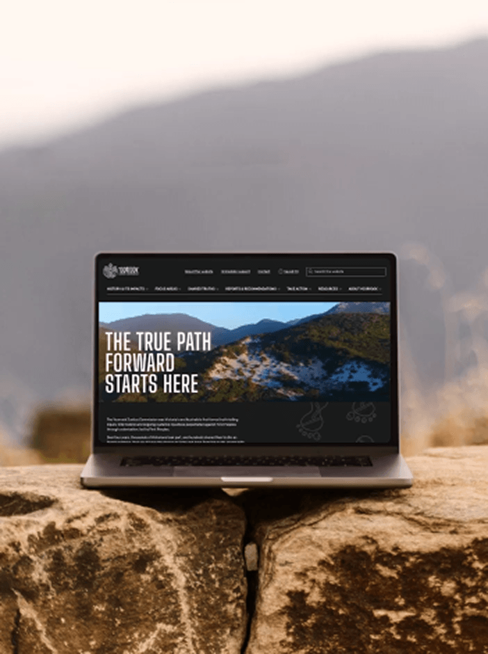
This new product journey was illustrated using low-fidelity wireframes that helped internal stakeholders visualise our plan for the website, and also formed part of the component-based approach that the front end build would take down the track.
Iterative prototyping
Our next step was to develop a prototype of the new user experience that could be tested and validated with real users. Working in two week sprints, we built a high-fidelity prototype of key features, using real copy and product images to make the experience as close as possible to our vision for the final product.
At the end of each sprint, we ran a series of user testing sessions that allowed us to gather feedback on the product flow, copy, visual design and interactivity of the prototype. Testing iteratively with each sprint allowed us to incorporate feedback early and pivot quickly where needed, reducing the amount of rework required later in the project. By building prototyping into the design phase, we were able to ensure we ended up with a solution that really worked for users before rolling out the designs across the whole product range.
To wrap up the prototyping phase, we created a detailed, comprehensive functional specification document that outlined how each feature worked and what would be required from a technical standpoint. This document would go on to become a key resource for the remainder of the project and was an essential step in our handover of the project to Officeworks’ development partner.

"><image width="100%" height="100%" href="data:image/jpeg;base64,/9j/2wBDAAYEBQYFBAYGBQYHBwYIChAKCgkJChQODwwQFxQYGBcUFhYaHSUfGhsjHBYWICwgIyYnKSopGR8tMC0oMCUoKSj/2wBDAQcHBwoIChMKChMoGhYaKCgoKCgoKCgoKCgoKCgoKCgoKCgoKCgoKCgoKCgoKCgoKCgoKCgoKCgoKCgoKCgoKCj/wAARCAAIABQDASIAAhEBAxEB/8QAFwABAAMAAAAAAAAAAAAAAAAAAAIEB//EAB8QAAIBBAIDAAAAAAAAAAAAAAABAgMREhQFIUFRUv/EABcBAAMBAAAAAAAAAAAAAAAAAAIDBAb/xAAWEQEBAQAAAAAAAAAAAAAAAAAAAkH/2gAMAwEAAhEDEQA/AMjkk5U8r437K3IauxGpQjNuP14ANhqWU1O6T9gAIt//2Q=="/></g></svg>)

"><image width="100%" height="100%" href="data:image/jpeg;base64,/9j/2wBDAAYEBQYFBAYGBQYHBwYIChAKCgkJChQODwwQFxQYGBcUFhYaHSUfGhsjHBYWICwgIyYnKSopGR8tMC0oMCUoKSj/2wBDAQcHBwoIChMKChMoGhYaKCgoKCgoKCgoKCgoKCgoKCgoKCgoKCgoKCgoKCgoKCgoKCgoKCgoKCgoKCgoKCgoKCj/wAARCAALABQDASIAAhEBAxEB/8QAFwAAAwEAAAAAAAAAAAAAAAAAAAIECP/EACMQAAIBBAIABwAAAAAAAAAAAAECAwAEERIFQRMhIzEycYH/xAAVAQEBAAAAAAAAAAAAAAAAAAADAv/EABcRAAMBAAAAAAAAAAAAAAAAAAABESH/2gAMAwEAAhEDEQA/ANCePZsgjRoxIPMkjGDTomSJQkZiAwXDdfVS8zaW6WcbpEod3XY496fhiRaQxj4bEY/aW0ODTvbmT09cAdCiqr6NFmAVQBqOqKRPCGtP/9k="/></g></svg>)

"><image width="100%" height="100%" href="data:image/jpeg;base64,/9j/2wBDAAYEBQYFBAYGBQYHBwYIChAKCgkJChQODwwQFxQYGBcUFhYaHSUfGhsjHBYWICwgIyYnKSopGR8tMC0oMCUoKSj/2wBDAQcHBwoIChMKChMoGhYaKCgoKCgoKCgoKCgoKCgoKCgoKCgoKCgoKCgoKCgoKCgoKCgoKCgoKCgoKCgoKCgoKCj/wAARCAALABQDASIAAhEBAxEB/8QAFgABAQEAAAAAAAAAAAAAAAAAAAQH/8QAGxAAAgIDAQAAAAAAAAAAAAAAAAECEQMEEmH/xAAWAQEBAQAAAAAAAAAAAAAAAAAEAAH/xAAWEQEBAQAAAAAAAAAAAAAAAAAAATH/2gAMAwEAAhEDEQA/AN5nLmLaTfiJltS7SeLJy3V0VgYJcAAan//Z"/></g></svg>)
"><image width="100%" height="100%" href="data:image/png;base64,iVBORw0KGgoAAAANSUhEUgAAABQAAAAbCAYAAAB836/YAAAACXBIWXMAAAsTAAALEwEAmpwYAAAGo0lEQVR4nJXQ+1OU5xXA8fcv6ExM7BDBG4jshWUXXFhYljsiihLuIldZBRG0EBlCAAVZdoFdLrvssgsLCwoSAeM1MYmXaKyXXjQz2timTdrEiUmNxqhYo6Z16rezr7TTznQ60x8+c87zvM9zznlegR8f8v947vV09kWcy//+5AHPHj/gr4/uIfzPi/8Gb5Gnszx7fJ8fH97lh++/Zfb219z781fcvXmDW198zo1PP0XgqffwCy86znV9/IC/PbrH09nv+OH72/zlzjfi5Vtf/pEvfvsJ169c5uMLl/jVufP84uw5zp86w9n3TyM8fzILTx7y/PEszx7d58n9Ozy8/Q3fffUlNz//PZ/95hqfXL7Cxxcv8cuPfs5HJz/k5LH3ePfgMY7OHObI9GEOTx+acxjh6b07PL77LQ9ufS2O/YdrV7ly8RLnT5/h9PEPePfQMY7MHObg/rc5MHmA6X3TTE1MMzU+9cLEFNMT0+L+zOQMwmfXrnL9yhUun7/A2Q9O8s7BoxyYnGH/+H4m90wyMTrB3pFx0fjIOBOeCXFvYnSfaN+Y16TIuxaOzBzk7bdmeGvvJOOeccaGxvAMeuaMMuLyMOwcYXhgBI/Tw9jgqHhmj3sPY/+FMGgfwmUfxNnvZMDmZMDqNSBGp82Jy+bCOWewf5BhhxuPcwSPyyM2GxGN/CsXrBYrfd199HX30mfpw2q2YrXYsHX3099jx9HnEBs4rU5c/S6GHEPixP8sMOwcxu1wMzRH6O7oxtLZjTd2tXdhbDVi2GXA0NJOe4sRU1sHXYZO8ZvZaMZistDT2SPqM1txWgcYsg/i6h8UXyGYTRYs3mJGM031jWwu1bM+O4+cjCxRblYO67NyyRNjDvk5eWzIzSc/Zz36kjLamltwWR3i9N5XCGZvMZNFnKR2Wy3p6Zno4pKIiIohIkpHpC6OqJgEInUJaKLjCdfGEhYeRYgyFJ1WR3XFVmyWPobsTtx2J4I4nclC+24Tb9Q3U1HTQOm2BgoqdlBYWU9JTQsFtW1kbW1mjb6OhLxNaBLTUK6IQKvVUV5WTk+HBbd9gDGn88U/9D67vdXIzqYWdhu7MPY6ae0coNnk4I1ON1WGQfJqO0ku2UHU2g2ERcejDFMSE62hokyPub0TZ5+NEbv9Pws21tfR2liHpcuEwWBk28/q2KivoKhET1pmISt0q1mmjGSpTEmALBh1RDibS0qxtJlw9fQx5uhH6DX3YDGZMbbuZsf2KqrKS6ir3cq2qnJyczJYuzKGjJRYUpOSUUfEExCswVcSjk9QBPKwaLaUbsTZ0cHkgI2jngEEm9mMqbmBpu2b2JT/GqnJcaSsjGNlciwxOg2aFQrUSgkhchlBkmCWBMpZsFTGTxdLkSlWUKMvYdpm4sRoN2f2mBFcXbtpqsyjMlNDTqISjUqGQi4VyWUSpEGBBPgvZqHfAvx8fVno54efnx++vr6o5FKaKws45W7l4tguzrkbEI44d2Fv2ECLPo6qrCiSNUpCpUEoJYGoJMtRSZeLeXCgP7KAJSKp/yKkSxeRpAmlt76MX08auH7AyLUpA8KJwUaOD9RxzFaDq6mMzRmJJKnlRAUHEhW8nLhQKSs1ShLUCnQhUrSK5ehCAkkIk1K0JobhXRVcne7gxvsObp4aQnA3FXPAXM2HQ40ctdbSVZ2Ffk0Eq8IDiZL6ESnxRStfSOgyX1QBrxKjWEx2rJwt6zTsKk1h784iLgzX87uDXfzpuB1h+M08Rps2sK+liClDMWONufRVp9JUGENhopQkhQ9q/5cIXTqP1erFbM8Ix7JlFa7X0xlvzOWQoZh3OjfyXncFJ6zVCI6aNHoqU2gu0Io69LH0bknCWZOGoTSWorhAVqkWkBMdgLEsnn2N2bhr0mgv1tFZGoutMoXuTUkYCqNpydcgbE9XUp+tpiJVTkFMAGWJgdSsU9BRFkvn5gSq0hTkRi+lMk2JuzaN8bq1NGaGkqv2FRVpl1AYtYQi7WJKoxchbF4p4fXXQtiaKqFAt4SC6EWUJwXQmBuGoTSamnQFxfHL2J6uwqyPZ2fOCoqiFrFK8jJp8vlkqXzICfOhUONLqXYhQvUaCY05Khoyg6lKWUZ5kj+1a2W0FWno0sfQkK2ieo2Mprxw2goi2RjrT6r8FZKD5pGh8iE/3Jd89avkq33IVs1H2JToT0OWAsOGUN7MlLFjnRRjcST26iQc1cl0bNTSWhhJb0UC3WU69HH+pEhfJnn5S6QFzyddMZ+MkFfIUsxjddBP+AdKPDRlv1J/qwAAAABJRU5ErkJggg=="/></g></svg>)

"><image width="100%" height="100%" href="data:image/jpeg;base64,/9j/2wBDAAYEBQYFBAYGBQYHBwYIChAKCgkJChQODwwQFxQYGBcUFhYaHSUfGhsjHBYWICwgIyYnKSopGR8tMC0oMCUoKSj/2wBDAQcHBwoIChMKChMoGhYaKCgoKCgoKCgoKCgoKCgoKCgoKCgoKCgoKCgoKCgoKCgoKCgoKCgoKCgoKCgoKCgoKCj/wAARCAAbABQDASIAAhEBAxEB/8QAGQAAAgMBAAAAAAAAAAAAAAAAAAUCBgcE/8QAJhAAAgEEAQMEAwEAAAAAAAAAAQIDAAQFEQYHEmETITFRFEFCcf/EABYBAQEBAAAAAAAAAAAAAAAAAAUGB//EACERAAEEAQQDAQAAAAAAAAAAAAEAAgMRBAUSITFRcfFB/9oADAMBAAIRAxEAPwBV1LYDl+Rc3Czr377h/Pil3GHx2QuBY3g/HaYjVxLsemPsD97qw86wiY7nDQWm5RI4kKuPbZPx5qHVHF3SZDGTLFFBHHEQyqui3j/KcyNRbHLDACKPZuiPHz9U3jaa+WGXILTY6FWD5+jpVfK28NrkbiC2mE8MblVkHww+6K6bHAZW+txPaWM0sR9gyrsGim97RwSgyxx5AW0dWbO3iWwyXpATrMFaQfPbSDm8sfK7qzOJ7nIQIykaJPgVZ+tbtHwqV0OmEi6NZF0QvLi55rbLPM8igtoMd69qzrNxHyzuIdwdvtafpmayHEbbbLd/pb7w/ArgcDb2PeXZdsxP2aKfUVQElxsqTAA4C//Z"/></g></svg>)

"><image width="100%" height="100%" href="data:image/jpeg;base64,/9j/2wBDAAYEBQYFBAYGBQYHBwYIChAKCgkJChQODwwQFxQYGBcUFhYaHSUfGhsjHBYWICwgIyYnKSopGR8tMC0oMCUoKSj/2wBDAQcHBwoIChMKChMoGhYaKCgoKCgoKCgoKCgoKCgoKCgoKCgoKCgoKCgoKCgoKCgoKCgoKCgoKCgoKCgoKCgoKCj/wAARCAAbABQDASIAAhEBAxEB/8QAGQAAAgMBAAAAAAAAAAAAAAAAAAUCAwQH/8QAJxAAAQMDAgUFAQAAAAAAAAAAAQACAwQREgUiBhMhQWEWMTJRUoH/xAAXAQADAQAAAAAAAAAAAAAAAAACAwUG/8QAHhEAAgICAgMAAAAAAAAAAAAAAQIAEQMhEiIxQXH/2gAMAwEAAhEDEQA/AINZkQB3Tr01WbbmLcLjck3MiiGT3t/psEon4x0+LUHUs1S8FvTMHaoq79XNXkNV2A+x/XaZLRz8qXEusDtN0KmGvoqiNsjauJ4PfNCSX34jlUVszhWrcV1epbZJXhn5HQJJLWXPyN/KX5H7Qwku6q4FCihMk2VnNsZuFbI0WbI8DwULAXG/uhFQg8jP/9k="/></g></svg>)