Probably the most obvious consideration for multi-regional website design is how the typography will look. For the majority of websites, text is the most important element—after all, this is the information users are coming to the site for. Great care and effort is placed into writing quality copy, as is ensuring that it is displayed effectively with a clear hierarchy.
A key challenge that comes from multi-regional websites is how languages with very different character compositions, like English to Mandarin, are handled during the translation process from a visual perspective. For example, a hero banner that allows for 50 characters at 70px font size may look perfect in English and other Roman alphabet languages, but once these characters are translated into Kanji, the spatial difference is significant and may leave the banner looking completely unbalanced.
Another consideration is how a paragraph of translated text is handling its line breaks. In languages such as Mandarin and Japanese, the way a set of Kanji are grouped is immensely important to the meaning of that text. If a line is broken in the wrong way, it could lead to text that is no longer readable.
Font choice also needs to be considered for translated text. During a recent regionalisation project, we found that our client’s English brand font was not bold enough when translated to Thai characters, so we decided to explore other font alternatives. As we started searching, we found many font options with the distinctive loops found in Thai typography, but also a number of fonts that omitted the loops and were closer in appearance to Roman characters.
This led us down a bit of a rabbit hole in an effort to understand which style we should be using. We learnt that the loop-less fonts have become increasingly popular over the last couple of decades due to their efficiency, but are considered inaccurate and hard to read by many Thai speakers. This kind of nuanced investigation and reflection is so important when it comes to digital content translation and presentation.
This kind of discovery underscores the importance of seeking feedback from local users to ensure that your designs will test well in international markets, and are just as well considered as the original English language version.
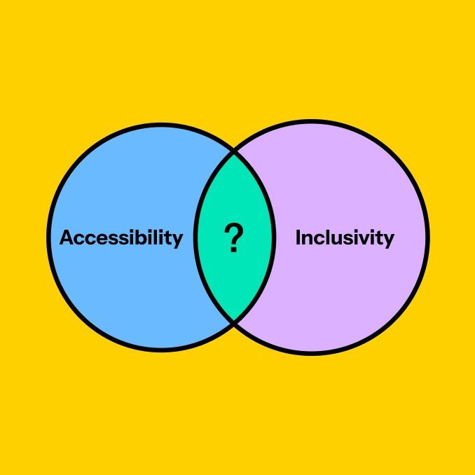
Design checklist
- Consider the spacing and character count of key headings and content elements when translated from one language to another to ensure your design is appropriate for all language implementations
- Consider how line breaks will affect character groupings in translated languages
- Explore font options for languages with non-Roman scripts, and the cultural sensitivities surrounding this choice

"><image width="100%" height="100%" href="data:image/jpeg;base64,/9j/2wBDAAYEBQYFBAYGBQYHBwYIChAKCgkJChQODwwQFxQYGBcUFhYaHSUfGhsjHBYWICwgIyYnKSopGR8tMC0oMCUoKSj/2wBDAQcHBwoIChMKChMoGhYaKCgoKCgoKCgoKCgoKCgoKCgoKCgoKCgoKCgoKCgoKCgoKCgoKCgoKCgoKCgoKCgoKCj/wAARCAAIABQDASIAAhEBAxEB/8QAFgABAQEAAAAAAAAAAAAAAAAAAAQH/8QAIRAAAQQCAAcAAAAAAAAAAAAAAwABAgQFERITIjFBYXH/xAAVAQEBAAAAAAAAAAAAAAAAAAAEBv/EAB8RAAICAQQDAAAAAAAAAAAAAAECABEDBAUhkRNR0f/aAAwDAQACEQMRAD8Az63impABaHWd3K2ubLq4NpjCVoVrMqAzBtb1ObP39siILGmoepRYFGbTnM/LB+xY4Mqr3hDG0T0IHJ5JPe3+oiInmaVrbbgJuj2fs//Z"/></g></svg>)
"><image width="100%" height="100%" href="data:image/jpeg;base64,/9j/2wBDAAYEBQYFBAYGBQYHBwYIChAKCgkJChQODwwQFxQYGBcUFhYaHSUfGhsjHBYWICwgIyYnKSopGR8tMC0oMCUoKSj/2wBDAQcHBwoIChMKChMoGhYaKCgoKCgoKCgoKCgoKCgoKCgoKCgoKCgoKCgoKCgoKCgoKCgoKCgoKCgoKCgoKCgoKCj/wAARCAAUABQDASIAAhEBAxEB/8QAGgABAAEFAAAAAAAAAAAAAAAAAAMBAgUGB//EACIQAAICAQMEAwAAAAAAAAAAAAECAAMEBRESEyExQRQiYf/EABgBAAMBAQAAAAAAAAAAAAAAAAAEBgIH/8QAIxEAAQIFAwUAAAAAAAAAAAAAAQADAgQFESEiUWEGEhMUMf/aAAwDAQACEQMRAD8A6ll59WO/Ahnb2F9S3F1BMpC+OjMqnY/kxOrYVvy7H5W8H7grK6FjPj1Wddra2J7AeTI6mdM0R+TZede1RC51AWO1uEyalPe8WPHozm3zbPK2CtxYoZfESLGrK1/bcEnfaJzqbabafjbai7oQSAdxdUUJJAJCniIiq2kREEL/2Q=="/></g></svg>)

"><image width="100%" height="100%" href="data:image/jpeg;base64,/9j/2wBDAAYEBQYFBAYGBQYHBwYIChAKCgkJChQODwwQFxQYGBcUFhYaHSUfGhsjHBYWICwgIyYnKSopGR8tMC0oMCUoKSj/2wBDAQcHBwoIChMKChMoGhYaKCgoKCgoKCgoKCgoKCgoKCgoKCgoKCgoKCgoKCgoKCgoKCgoKCgoKCgoKCgoKCgoKCj/wAARCAAUABQDASIAAhEBAxEB/8QAGQABAAIDAAAAAAAAAAAAAAAAAAEEBQYI/8QAIBAAAgIDAAIDAQAAAAAAAAAAAAECAwQFESFhEhMUMf/EABYBAQEBAAAAAAAAAAAAAAAAAAABAv/EABYRAQEBAAAAAAAAAAAAAAAAAAABEf/aAAwDAQACEQMRAD8A6MnJQhKUnxRXWVNXsKdlju7Hb+Kk4tP+objE/drr8frTnHxx88mH1VVcc3FrwqbKfqg1e2mlL17MW4rZQQDQAAAACD//2Q=="/></g></svg>)
"><image width="100%" height="100%" href="data:image/jpeg;base64,/9j/2wBDAAYEBQYFBAYGBQYHBwYIChAKCgkJChQODwwQFxQYGBcUFhYaHSUfGhsjHBYWICwgIyYnKSopGR8tMC0oMCUoKSj/2wBDAQcHBwoIChMKChMoGhYaKCgoKCgoKCgoKCgoKCgoKCgoKCgoKCgoKCgoKCgoKCgoKCgoKCgoKCgoKCgoKCgoKCj/wAARCAAUABQDASIAAhEBAxEB/8QAGQABAAMBAQAAAAAAAAAAAAAAAAEEBQcG/8QAJhAAAgICAQMCBwAAAAAAAAAAAQIAAwQRBgUSIRMUMTJBUWFxgf/EABYBAQEBAAAAAAAAAAAAAAAAAAMEAv/EABgRAQEBAQEAAAAAAAAAAAAAAAEAAiEx/9oADAMBAAIRAxEAPwDBTpa4tKCwC1WQsP1LPF/c18kpfpFox7bPIY+AB9Zi3cnWuurGbsNpBAJ86kYfIWXFaoWobV+UBda/sPOXXbC5ON3THzcihWW3M9w5bZcnUTgJ5hlKSLGs7h+IlItOl4XqDEkt8GU6BEnHdvQFnce/77iIWPJt1pb7CNliTEREjv/Z"/></g></svg>)